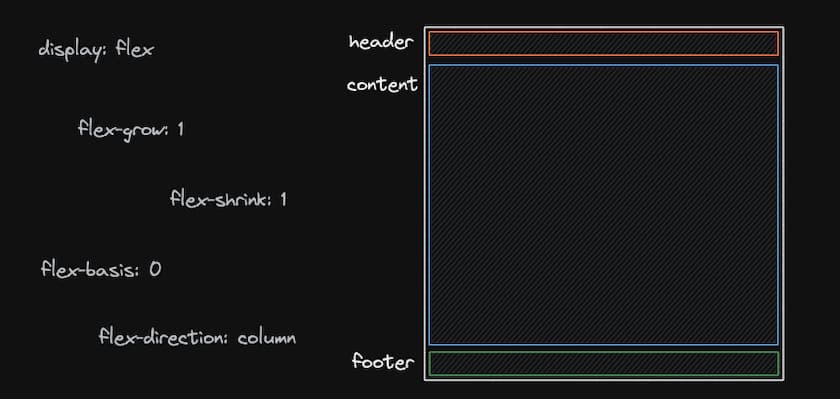
Layout - Header, Main, Footer
August 17, 2020 — 2 min read

As my first blog post I’m going to show a layout structure I’ve been using when I need a layout with header, main and footer.
A friend of mine needed help to position the footer always at the bottom of the page and scroll it down. The first test that comes to mind is the position absolute, of course, but the problem is that it does not follow the scroll and keeps floating in the middle of the page.
<div class="container">
  <header>Test</header>
  <main>
    Lorem ipsum, dolor sit amet consectetur adipisicing elit. Esse ut modi non
    commodi, dolorem expedita atque eos explicabo omnis doloremque illo,
    nesciunt nulla delectus, id molestias! Necessitatibus non illum fugiat.
  </main>
  <footer>Copyright 2020</footer>
</div>
In the HTML structure above is a standard layout on many pages, but how do you make the main occupy the entire screen area minus the header and footer areas?
* {
  box-sizing: border-box;
}

html,
body {
  height: 100%;
  min-height: 100vh;
  padding: 0;
  margin: 0;
}

.container {
  display: flex;
  flex-direction: column;
  height: 100%;
}

header {
  background-color: #3a3a3a;
  width: 100%;
  color: #fff;
  padding: 15px 30px;
}

main {
  flex: 1;
}

footer {
  background-color: #7159c1;
  padding: 15px 30px;
  color: #fff;
}
Before the .container is just a few CSS resets and setting the height of the html and body to at least 100% of the screen.
*CSS resets would be to remove some of the default styles that come natively in the tags_.
The point is just below, adding display: flex to the container, aligning the direction in columns and telling it to pick up 100% of the height is a start.
But that alone is not enough, the elements will still stick to the top of the screen. This is where the flex property comes in, which is a junction of flex-grow, flex-shrink and flex-basis, making the main take up all the remaining space in the container.
After making this layout, I found other ways such as using display: grid, but I found my approach so simple and reusable that I always use it when needed.
To easily test this layout, just enter this link: https://codesandbox.io/s/layout-vnpij?file=/styles.css:286-300
Some useful links:
Flexbox: https://developer.mozilla.org/pt-BR/docs/Learn/CSS/CSS_layout/Flexbox
Flex property: https://developer.mozilla.org/pt-BR/docs/Web/CSS/flex
